
Styling Elements
New This Month
This quality update brings canvas and layer panel improvements. We've updated the Component symbol throughout the app to differentiate it from Grids. Plus, we've made Primary Breakpoints and Variants more distinct in the left panel, making it easier to see if you're editing the primary or an instance. Breakpoints will now also show the ranges in the layer panel. See more updates below.
From January
Last month, we added support for automatic tinting and new layout options for components, plus a whole lot of fixes and improvements. If you give your Page a Fill color, this will now also tint browsers like Safari and will ensure you don't get plain white backgrounds when overscrolling on any mobile device. Plus, we've added support for Min Max sizing to all Smart and Code components, greatly simplifying many common layouts and patterns. See the full changelog below.
We automatically set the body background, based on your Page's fill color
You can now override the body background and customize per breakpoint
We now support Min Max sizing for all Smart and Code Component
We now consistently show the Min Max hint within the property panel
You can now use all alignment options for layers with Position set to Fixed
We now inform you if a parent layer height changes due to layout edits
We improved the Radius and Padding controls, no longer resetting values
Number inputs split in four no longer show steppers, so longer values fit
We improved Appear Effects using Scale with Spring transitions
Design Detail
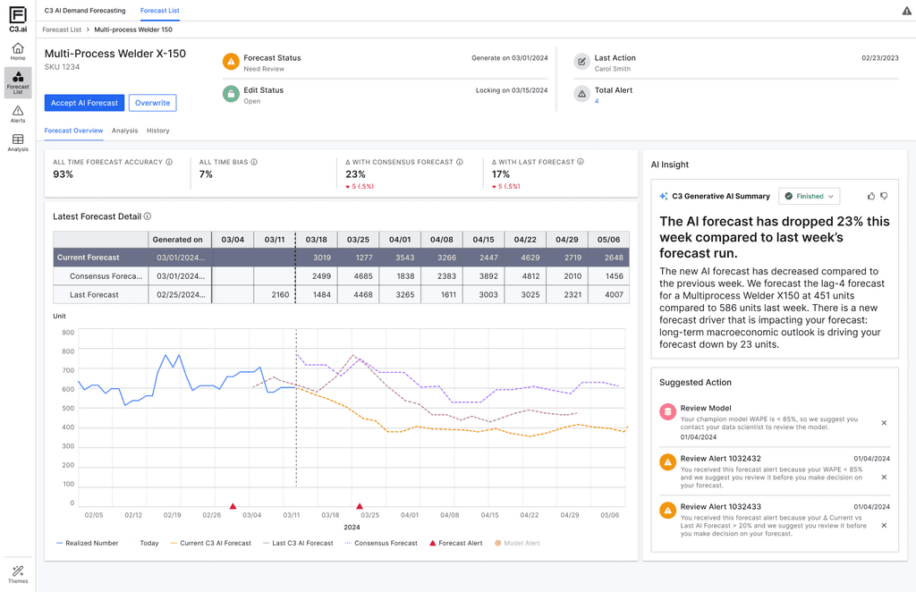
AI Forecast Overview with Natural Language Insight
Natural Language Summary (NLG)
Automatically generates plain-language explanations of key forecast changes. This builds user trust by turning opaque model shifts into understandable business context.
Progressive Disclosure
Information is layered by importance—high-level alerts and suggested actions are shown upfront, while deeper data (forecast tables, trends, version comparisons) remains available but non-intrusive. This reduces cognitive overload and lets planners focus on what matters first.
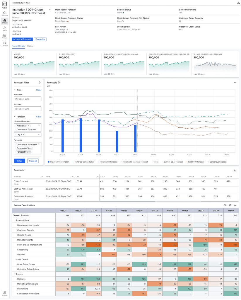
Forecast Visualization & Feature Contribution
Shows AI forecast alongside historical demand, historical forecasts, and consensus forecasts—enabling users to visually validate the AI output, compare trends over time, and detect anomalies or shifts. This supports planners’ natural tendency to “sense-check” data before taking action.
Breaks down how individual input factors (e.g., weather, promotions, market signals) are driving the forecast up or down, across time. The color intensity helps users quickly identify dominant influences on the forecast, improving interpretability and model accountability.
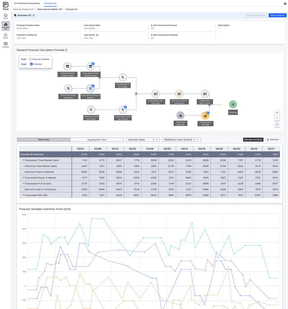
What-if Forecasting & AI Equation Visualization
Scenario Simulation Panel
Enables users to create alternative forecast scenarios by editing key input variables. This supports a common behavior among planners: comparing multiple versions of a forecast to validate assumptions and evaluate potential outcomes.
Forecast Equation Node Graph
Visually illustrates how the AI model calculates its output using market share, sell-out rate, mix, and scripts. This helps users better grasp the internal logic of the model and builds transparency around how different variables interact.